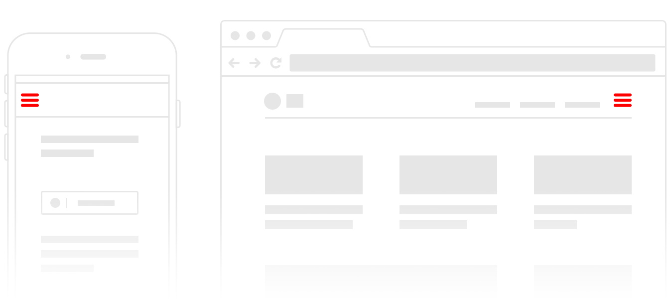
The hamburger menu icon is one of the most ubiquitous icons on the web. It is usually used to indicate a menu bar, and it is often placed in the top-left corner of the screen. But there is some debate over whether the hamburger menu icon should be on the left or right side of the screen.
Table of Contents
Brief History
The hamburger menu icon was first introduced in the early days of the web (when we did not design for mobile screens), and it was usually placed in the top-left corner of the screen. This was because the top-left corner was the traditional location for the menu bar. But over time, the hamburger menu icon has been used in other locations, including the top-right corner of the screen.
Right or Left?
There are several arguments for why the hamburger menu icon should be placed on the right side of the screen. The first argument is that the right side is the traditional location for the main navigation menu. The second argument is that the right side is the location of the main action buttons, such as the “submit” button – although I personally do not like it. The third argument is that the right side is the location of the global navigation menu.
There are also several arguments for why the hamburger menu icon should be placed on the left side of the screen. The first argument is that the left side is the traditional location for the menu bar. The second argument is that the left side is the location of the primary content area.
So, which side is the best location for the hamburger menu icon? There is no definitive answer, and it depends on the specific website or app. However, the general consensus seems to be that the hamburger menu icon should be placed on the right side of the screen for most websites and apps.


Mobile Screens
On mobile screens, you must put it on the top-right if the menu icon must go on top. Otherwise, the best alternative is to not have it on the top at all. This is because the top part of the screen is not reachable by the thumb on most devices, making it difficult or impossible for users to access the menu.
Test with Users
The best way to decide where to place the hamburger menu icon is to test it with users. Try out different locations and see which one is the most user-friendly. You may also want to test different icon designs, as users may have different opinions on which design is the most user-friendly.


