A progress bar indicated the progress of a background process. A progress bar fills up based on the proportion of a job completed, thus the term “progress bar.” Programmers develop progress bars tick by assigning a percentage to specific milestones throughout a process.
Do Backward Animating Progress Bars Look Faster?
Short answer: Yes. But wait up; there’s actually a psychology behind it.
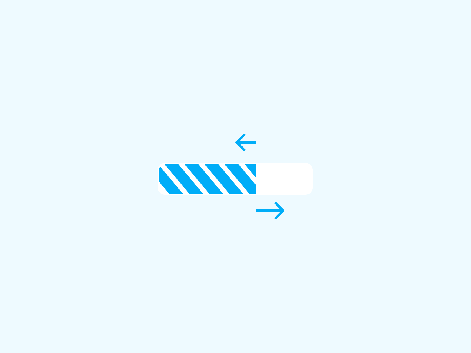
The first reason for this form of animation is that a progress bar with more pulsations is much more probable to be viewed as having a shorter duration. Furthermore, progress bars with the ‘quickest progress near the end of the procedure are regarded as being perceived speedier as opposed to progress bars which have pauses at the end.


The front of the progress is the major anchor point. When you see a reverse animation, your brain creates small anchor points. Since the tiny anchor points are moving to the left and the progress is moving to the right, it appears like the distance is growing. As a result, it looks that the bar is moving quicker.
The major reason for this is so that the user can see if the website or application is still operational. The moving bar essentially informs the user that the application is active and not stuck in the background.
If a progress bar isn’t animated and hasn’t moved in a while, the user may believe the program isn’t responding. This usually happens when a coder uses the UI thread to complete a job.
However, despite the fact that progress bars are animated backwards to reduce time perception, users still tend to click away due to the increased tolerance for waiting time that these progress bars induce.
To substantially decrease the waiting time period, designers should regard the significance of the emotional experience of the design of the progress bar. Many progress bars tend to use elements such as cartoon animations or company logos to improve the emotional experience of the user.
In order to improve users’ experience, designers can also make use of interactive progress bars, which can let users play games during their wait time.

Are progress bars good UX?
From the standpoint of user experience, progress bars are quite beneficial. Users desire to accomplish their jobs as quickly as possible. However, there will be procedures and activities that will put their patience to the test.
You can help your consumers wait by developing effective, relevant progress bars as a designer. This will enhance the usability and user experience of your website or app.
Progress bars should be used sparingly. They are beneficial, but they are not pleasant conditions for users. As a result, utilize progress bars to:
- Alert visitors to tasks that will take some time.
- To keep consumers updated on the status of a multi-step action, such as filling out a form or placing an order.
In conclusion, don’t provide your users false progress updates merely to keep them from quitting your site. Users will be misled by an incorrect progress indicator, creating even more frustration.

