Using an optimal font size is important. When developing a design system, designers and developers must work together closely, particularly when it comes to typography. Typography designers have been discussing the relationship between horizontal and vertical eye movement for nearly a century. When Jan Tschichold campaigned for the left-alignment of text in 1928, it was a radical departure from the norm.
The leading (also known as line-height) refers to the distance between each line of type in a document. In most cases, the default leading provided by page layout applications is enough, but there are a few situations where it may need to be changed. Fonts with long ascenders and descenders that touch one another between lines of type might be distracting to the reader’s eye.
To create the illusion of tight leading, fonts with a high x-height eliminate the negative space between lines of type. It can be difficult for the reader to tell where the next line begins because of tight leading, which is most visible in long lines of text.
As a result, for types with wide columns, a higher line height improves readability. For body text, users can typically adjust the leading so that the height of capital letters fits precisely between lines of type, which is around 1.5 times the font size.
Is there an optimal font size/line-height ratio?
If the line height is too low, it may discourage horizontal eye movement and encourage skimming along the left side of the page. As a result, people may be forced to reread sections of material. When lines of text appear to “float away” from each other, a line height that is too slack could be to blame. Vertical scanning will become more difficult because the lines will no longer feel like a unified unit.
A fair rule of thumb is to set the line height at about 150 percent of the font size, although there is no such thing as a perfect line-height.
Line height
Percentage of font size typically used to measure line height or line spacing. Line spacing between 130 percent and 150 percent is considered best for reading, although even up to 200 percent is acceptable, according to conventional opinion.
Line height is determined by the font’s style and size. There is no one magic number that works for every piece of writing. A reasonable starting point is 1.5 times the font size in line-height, and from there, you can fine-tune as needed.
When employing 1.5 line-height, an 8-point grid scheme works nicely. For this theory, a line-height of 8 and a base font size of 16 are ideal.


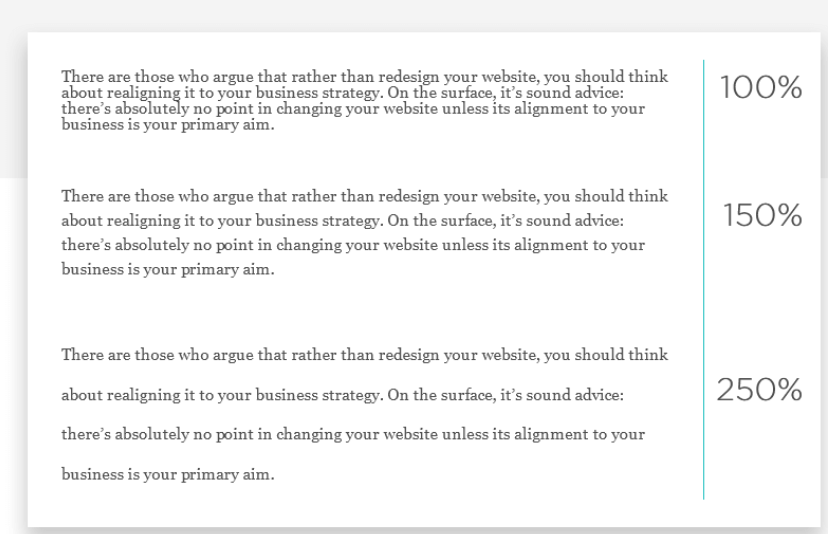
Each of the characters on consecutive lines in the 100 percent paragraph comes within millimeters of colliding. This is a problem since anyone with some degree of vision impairment will have a tough time reading this.
At 150 percent, the text is readable, and the space is well-balanced. When it comes to the paragraph with a 250 percent line spacing, it appears like it’s going too far. Reading the text feels annoying.


