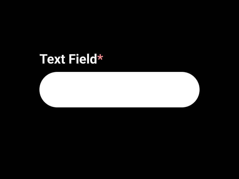
When it comes to web forms, there is always a debate about whether or not to mark required fields with an asterisk (*). After all, if all fields are required, then why not just mark them all as required? The short answer is yes – error prevention is better than cure. But the long answer will have other solutions you might want to read e.g., visual indicators.
Let’s discuss the scenario when all fields in a form are required.
When it comes to web forms, one of the most important aspects is to ensure that all the fields are filled out. This is especially important if you are asking for personal information, such as a name or email address. However, if all the fields are required, then it can be easy to forget to fill out one of them, which can result in an error.
One way to prevent this is to mark the required fields with an asterisk. This will let the user know that they need to fill out all the fields, or they will not be able to submit the form. This is especially important if there are no other visual indicators, such as a message that says “All fields are required.”
Another way to prevent users from forgetting to fill out a required field is to use visual indicators. This could be a message that says “All fields are required,” or it could be a border around the required fields. This will help to remind the user that they need to fill out all the fields in order to submit the form.
If all the fields are required, then it is a good idea to mark them as such. This will help to prevent users from forgetting to fill out a required field, which can result in an error. You can use either asterisks or visual indicators to mark the required fields.
As a UX Designer, I always recommend marking all required form fields as required, unless there is a specific reason not to. This will help to prevent users from forgetting to fill out a required field, and it will also help to ensure that all the information is entered correctly.


