Long story short, “Log In / Sign Up” works better.
You are probably here because you are a designer or a developer having a debate on whether to use ‘sign in/sign up’ or ‘login/register’ or any other combination of these words.
What makes sense is that we need to distinguish these two words since they perform quite distinct roles and address consumers with very different attitudes. The first is a new user who wants to ‘Sign up’ or ‘Register,’ while the second is an existing user who wants to ‘Log In’ or ‘Sign in’ to their account on the system.
When it comes to user experience, consistency is essential, and whichever method you choose, you’ll need to apply it to all of the products or websites you’re working on.
Table of Contents
Why is it a problem?


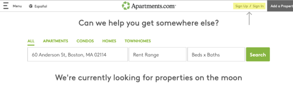
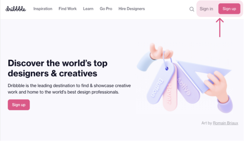
The usage of sign up and sign in has a pleasing symmetry that will undoubtedly attract a large number of individuals. Unfortunately, because of the symmetry, the user’s ability to distinguish the button he needs is reduced to only two letters. It’s easy to mistakenly choose to sign up when the user is meant to choose to sign in.
The first letter of the first word of the first button is also the first letter of the second word of the second button. It becomes as confusing as the last sentence is. This is something we’ll call the visual symmetry problem. The visual symmetry problem is not related to the conceptual symmetry problem. If you have a button that says “Sign Up” then, assuming that the user needs to “sign up” to use your site, the button is not wrong. However, if you have buttons that say “Sign Up” and “Sign In”, and you want the user to “Sign In”, then the visual symmetry problem is very real.
Just because everyone does it doesn’t imply it’s excellent UX. There are a lot of terrible UX patterns out there that are norms.
Many companies’ fates are almost entirely determined by one point of conversion, and that is when a customer turns into a user. Far too frequently, this critical duty is borne by a generic “sign up” button, which is lucky to receive even a minute of thought during creation.
If you think about the language of your signup button, you can dramatically boost the number of visitors who become users. Since they demand blind commitment, the typical “Sign Up” buttons don’t work.
How to make the Sign up button work?
- Make it relevant to your product: “Start Selling Art” if you have an artist marketplace. This makes it less likely that the button will be ignored.
- Give instead of taking: The words “Get Access” and “Sign Up” both mean the same thing, yet one gives the impression that the visitor is gaining anything while the other does not.
- Motivate people to take action: ‘Get’, ‘start,’ and ‘try’ are examples of action verbs that will prompt people to act and make an account on your page.
- Don’t add too many words to the CTA: What we’ve found is that, in general, the more words you add, the less attractive the button becomes.
So, which one should I choose?
Use ‘Create Account’ instead of ‘Sign up’
Create Account is just a more accurate representation of the action being offered. Using the term “Account” opens the door to features like ‘Account Settings’, which are tied to the notion that each user has an individual account.
This function is generally associated with log in/sign In functionality, and if you choose to sign In, you’ll end up with two almost identical buttons, as shown below.


Use ‘Log in’ instead of ‘Sign in’
Keep in mind that “log in” is a verb and “login” is a noun. The names of the buttons should be verbs, but the reference to the login experience should be a noun. Using “Log in” and “Sign up” helps users distinguish the terms and according to research, works better.


