The internet is full of traffic signal concept designs.
Designs for traffic lights can be found in several of these concepts. It’s possible to display animations or a variety of colors in a single module, which should make driving a little more interesting.
As of today, it is possible to incorporate all hues into a traffic light, and it also saves money. So, what’s the deal with having three different lamp bodies for the three distinct colors?
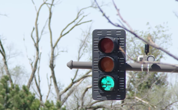
Because drivers value the placement of the light as much as the light’s color, drivers and pedestrians who are colorblind can tell which color is being illuminated by the light’s position, there is a red light at the top of vertical traffic signal heads and a red light at the left. For individuals who are colorblind, these locations indicate a halt.
For example, it could be difficult to tell that a traffic light has changed from green to red if all the light colors are contained in a single module. The position of the traffic light is just as significant as the color of the signal in terms of traffic safety.


More than just color perception, the human eye is capable of detecting movement in the distance. The movement of things in the area of vision is easier and more detailed to see. As we drive or wait at a traffic light, we keep the traffic light in our field of vision and keep an eye on the road and other traffic.
Because of this, we notice that traffic lights change their position before they change their color.
For vehicles and pedestrians, this will make it easier to see traffic lights and provide a safer environment.
LED lights and their drawback


When cities began using modern LED traffic light arrays to replace outdated incandescent bulbs, it had a slew of advantages. When compared to traditional light bulbs, which can be replaced every two years, LED arrays have a far longer life expectancy.
With less energy consumption comes a savings of thousands of dollars in electricity bills. Also, they’re a lot more efficient than incandescent bulbs, which produce a lot of waste heat in the form of heat radiation. However, this turned out to be a major drawback.
Traditional traffic lights were able to withstand even the most severe snow and ice storms because of the surplus heat they generated from incandescent bulbs. However, the use of LEDs could not withstand it due to their improved efficiency.
Traffic Light System in UI design
The most common way to use the traffic light system is to display the status of the product in the form of a traffic light. This is mainly due to the fact that the traffic light system is intuitive and easy to use. It conveys an accurate meaning and can be generalized to other applications. In addition, it is good for users to understand the current status or the meaning of the design.
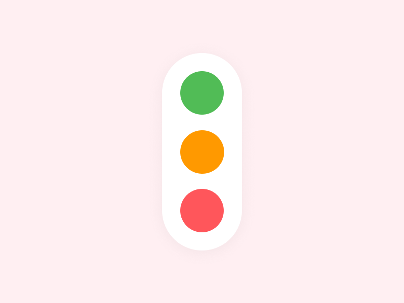
Traffic light system is very common in UI design, for example, one can easily find out that the buttons in iOS is a traffic light system, a green light to go, a red light to stop, a yellow light means caution, which is used to indicate the user that he should take action but the action is not urgent.
Conclusion
We’re all colorblind, at least in our peripheral vision.
At 30 degrees from your eye’s fixation point, you begin to lose your ability to see in three colors. Colour recognition gradually begins to go away as a result of aging. You are effectively color blind at 50 degrees. What you see in your mind isn’t what you’ve actually seen; your brain has simply filled in the blanks.
Your eyes, on the other hand, are excellent at spotting movement at these extremes of speed. Movements in our field of vision elicit a saccade response from us, enabling us to observe them in greater detail.
Using a single bulb, we may not be able to see the transition from green to red because nothing has changed in our peripheral vision. In other words, it isn’t just the color that makes us notice the signal, but the movement of the bulb position.


