User interface (UI) design is a method used by designers to create user interfaces for software and electronic devices. Designers strive to build user-friendly interfaces that are also enjoyable to use. In addition to graphical user interfaces, UI design encompasses voice-controlled interfaces and other types of interfaces.
The user interface (UI) should be a pleasurable experience as well (or at least satisfying and frustration-free).
Users can have more personalized and engaging experiences when your design anticipates their demands. They’ll keep coming back if you make them happy.
UI design is more concerned with the look and feel of a design than it is with its functionality. UI design is a craft in which you, as the designer, create a crucial aspect of the user experience.
User evaluations of designs are based on their utility and appeal.
What matters to users the most is getting their work done quickly and with minimal effort, which is why it is crucial to pay attention to every single detail when it comes to UI.
Little nitty-gritty details such as “sort ascending” items in UI design might be elements that may confuse the users and leave them scratching their heads.
Table of Contents
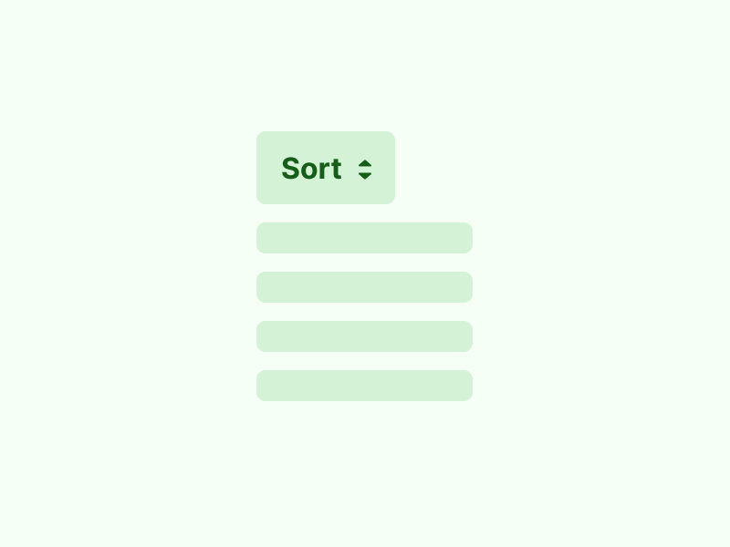
Use up or down arrow to represent “sort ascending” at table header
You may have noticed these up or down arrows to represent “sort ascending” at table headers on websites, but they have been difficult to understand.
Understanding “sort ascending”
Meaning of the word ascend:
- To ascend; move upward.
- To rise in elevation.
When someone rises from a lower level or station, it is called ascending.
What is the most effective UI?
The act of going back in time or ascending the chain of succession in a family tree.
The Microsoft Windows version, on the other hand, is correct in this regard. Ascending should be done upward.
It’s important to think of the alphabet this way: A is the beginning, and Z is the finish. As you progress from beginning to end, there is an increase. The same occurs with numbers where it is 1 to infinity.
Does the downward arrow indicate a high or a low number, high or low? Is the order of the letters ascending or descending? Aside from that, what exactly does the UP arrow mean? It’s possible the exact opposite is true, but given the issues posed, that doesn’t really signify anything. Simple though it may seem, the arrow on its own does not effectively convey what action is taking place.
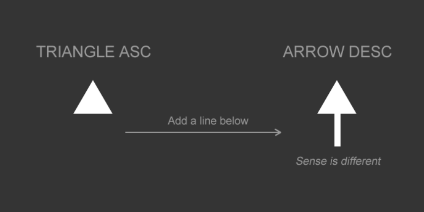
The ascending triangle’s smallest point is at the top, while its greatest point is at the bottom. You only see the triangle as a triangle and nothing else. The up arrow‘s direction is a bit more vague, but you may be able to tell that it‘s pointing upward, though that‘s a bit difficult to discern. Nevertheless, the up and down arrows should be accompanied by some form of text. If you can‘t do that, it‘s best to avoid them altogether.


There are many ways to see this triangle. A descending order arrow can be seen if you insert a line beneath.
So, what’s the final verdict?


It is suggested to utilize a common symbol like an arrow, triangle, or chevron for your design in order to reach your intended audience. Ideally, use text. The up and down arrows are not all that common in the real world, but have a place in software and information graphic design. The best way to denote the direction of the arrows is to use the word “ascending” or “descending,” but in some cases, this is not possible. In the case of software, using an arrow means the software will move in that direction. When the action of the arrow is not so clear, you should indicate some text to accompany it.
One last note: I’ve seen some sites that use the left and right arrows instead of up and down. It’s not entirely wrong, but it can be confusing when you are trying to evaluate the direction of the arrows. That said, if you want to change it up a bit, you can use the right and left arrows, but keep the word “ascending” and “descending” on the page in some form to make sure it is clear.


