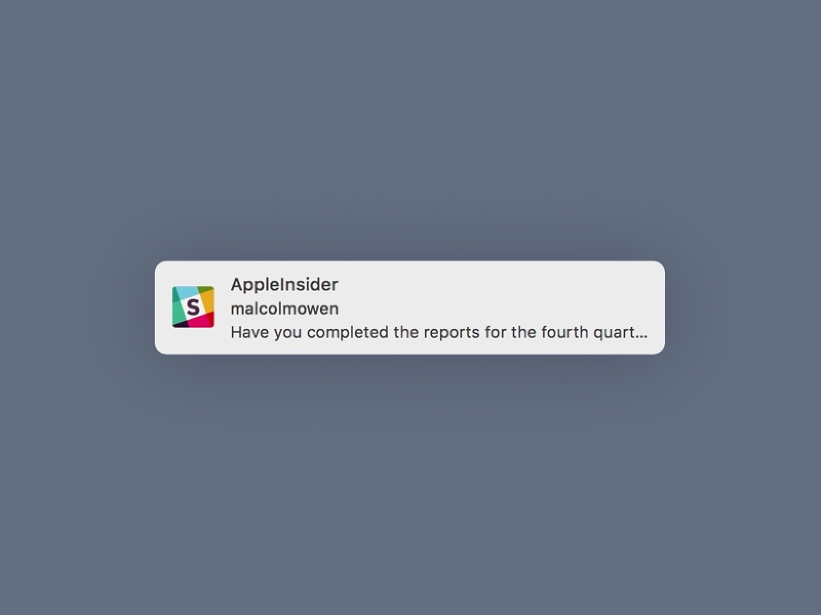
A toast notification is a non-modal, unobtrusive element to display a short message and it appears on the screen when an event occurs. It is used to provide feedback or show a message. Toast notifications can be used in any app, but they’re most commonly used in messaging apps.
Toast notifications appear as a small popup on the screen. They can be dismissed by tapping on them or by swiping them off the screen. If you don’t dismiss them, they will disappear on their own after a few seconds.
Toast notifications can contain text, images, and buttons. They can be used to provide information, show a message, or prompt the user to take an action.
Toast notifications are a great way to provide feedback or show a message in a non-intrusive way. They are easy to use and can be customized to meet your needs.
When to use it?
If you’re designing a UX of the app, you can place toast notifications at the following stages:
- When the user completes an action, such as sending a message
- When the user receives a new message
- When the user’s attention is needed, such as when you get an incoming call
Toast notifications can be a useful tool in your app but use them sparingly. Overuse of toast notifications can be annoying and make your app seem unprofessional.
Best Practices
Here are the best practices for using toast notifications:
- Keep the toast message short and to the point
- Use images sparingly
- Don’t use toast notifications for marketing purposes
- Use buttons in the notification sparingly
If you want more guidelines, you. can take a look at a list of descriptions of toast windows from multiple platforms:
Conclusion
Toast notifications are a great way to provide feedback or show a message in a non-intrusive way. They are easy to use and can be customized to meet your needs. Keep the toast message short and to the point, use images sparingly, and don’t use toast notifications for marketing purposes. Use buttons in the notification sparingly to create a great user experience.


