It is advised is to avoid using the term “Cancel” in the default action altogether. Instead, you can cancel something, for instance a subscription, by saying “Remove Subscription” or “Unsubscribe.” Using “Stop Downloading” to stop a download or “Revert Settings” to cancel a setting are other examples of more effective use of this function.
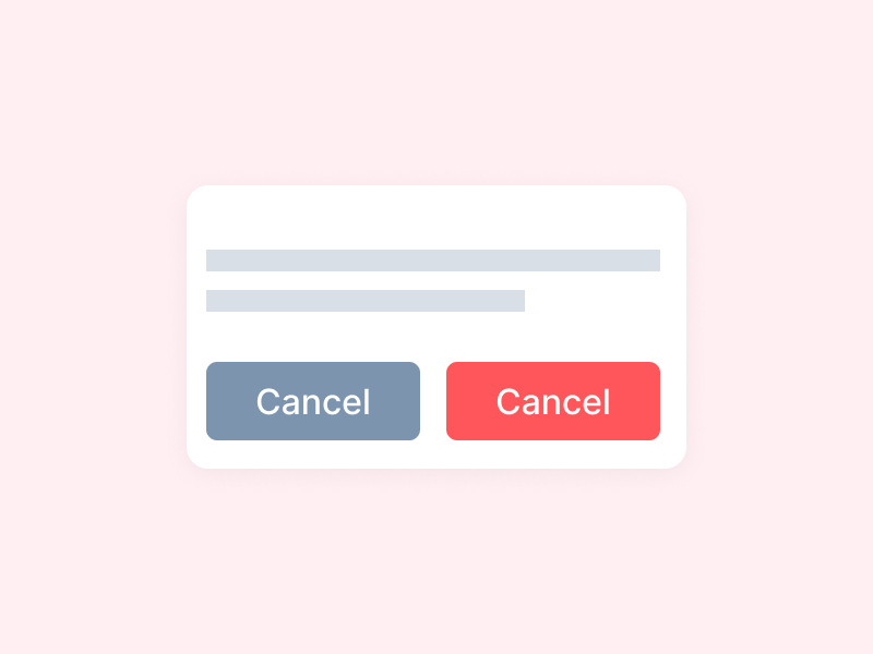
Give each button a name that describes what it does. If the default is “cancel,” the cancel button should be called something straightforward, such as “Don’t cancel.” It is to be noted that using the term ‘cancel’ in both of the buttons isn’t ideal, but it’s the most transparent option in this particular circumstance, and clarity is far more essential.
Other alternatives
Another alternative is to specify what you’re cancelling and use a term that doesn’t include the word “cancel” – for example, “Continue Subscription.”
In addition to this, you might want to consider removing the confirmation message entirely. You may instead show something like this:
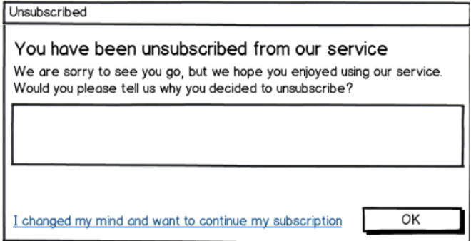

Note that there is a descriptive secondary option which would close the dialog or popup. Using a cross (x) button is also a good practice when it comes to dialogs. You could also send the users an email with roughly the same content and with the option to change their minds for a specified duration.
Why the term “Cancel” is confusing?
Users tend to scan or quick-read instead of paying attention to the text on the computer. Negative statements are famously difficult to read, and this is in addition to simply overlooking the small text on the screen. Senior citizens, for example, have difficulty when medicine comes with warnings about what not to do, while children are obligated to do what you tell them not to do.
When it comes to queries like “Don’t you have a password?” conventional “Yes/No” buttons might be highly perplexing and similar rationale applies to the “Cancel” and “Ok” buttons too.
The word “Cancel” can be a bit confusing because it can be interpreted in a variety of ways at different conceptual levels, such as
- Cancel and close the dialogue.
- Cancel the subscription
The preferred solutions for these are:
- “Stop downloading” and “Keep downloading”
- “Reset” and “Leave as is”
- “Unsubscribe” and “Keep Subscription”
Alternatives for alert boxes
An alert dialog box is typically used to provide users with a cautionary message. For instance, if an input field requires text input but the user does not provide any, you can use an alert box to display a warning message as part of validation.
Some alternatives which can be implemented are the following:
- Present informative messages that do not demand action in a non-obtrusive inline manner.
- Rather of verifying an operation ahead of time, just conduct it and enable the user to undo it later.

