When an object has a characteristic or property that prompts you to think about what you can do with it, it’s known as an affordance. To put it another way: affordances are signals that indicate how a user might engage with an object, whether real or digital.
You can open the door with the help of a door handle, for example. To make a call, you just have to click on the receiver symbol. Because affordances facilitate our interactions with both physical and virtual items, they make life easier for us.
Mapping
Mapping refers to the relationship between what you control and what you see in your environment. When designing an interface, you must think about the relationship between a control and its intended function. In the case of turning a knob, UX designers should pay attention to which way users have to turn the knob to increase or decrease the temperature.
By utilizing physical parallels and cultural norms, a natural mapping leads to an understanding that is immediately apparent. Designers can employ spatial analogies in the UI, for example:
- Swipe a slider to the right to increase a value in a slider component.
- Swipe left to lower the amount.
Natural mappings, like the universal standard that a rising level signifies more and a decreasing level represents less, are biological.
Which way to turn a knob to increase?
It is possible to tighten and loosen radiator thermostats simply by screwing them in and out. When you turn the valve counterclockwise, more hot water will be sent into the radiator.
To increase a value, turn the knob clockwise and turn the dial counterclockwise to reduce a value; this is the general rule for most electrical devices (e.g., audio volume, time, speed, etc.). On a linear scale, from left to right, lowest to greatest value, this increase/decrease is often depicted visually as an increase/decrease.
Modern digital and app-based thermostats tend to follow the electrical (clockwise/left to decrease heat, clockwise/right to boost heat) when it comes to operating the thermostat.
Things that work like taps and things that work like amplifiers are two distinct models. It is common for gas hobs to follow the “tap” model – anticlockwise is “opening” instead of “decreasing” in the sense of reducing.
Depending on the model, electric hobs can either employ the “amplifier” or “tap” model, depending on the user’s preference. Generally, the numbers are inscribed clockwise-increasing on either the knob or the backing plate.
It may be helpful to give the user a visual cue. For example, when you turn the knob on your car heater, you’ll see a visual indicator of the current setting.
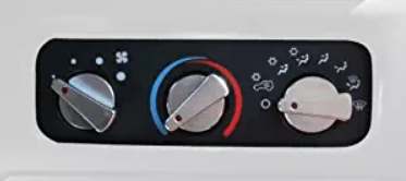

Alternatively, a vertical slider/button could be used to indicate that the temperature is rising.
It’s important to double-check the orientation of the radiator you’re using while developing an app for it. As long as the software understands which way to turn the physical knob, it is controlling; this should not be an issue.
Conclusion
In general, make sure to tell the user in a way that is clear and unambiguous so they don’t get confused. As a UX designer, it’s important to talk to users in user research calls and understand what how they think the affordance works.

