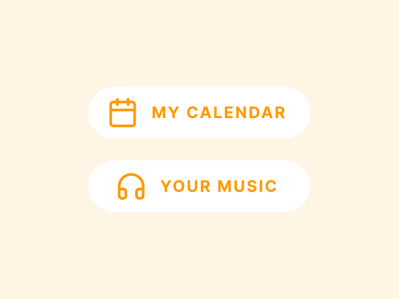
‘Your’ or ‘My’ in User Interfaces: This article will help you make the right decision when writing UX copy. We all strive to create customer-friendly websites that are approachable. However, when it comes to interacting with users, many websites get stuck in a rut, unable to keep track of who is saying what.
So let’s start with a simple problem: when should we use “your” and “my” when writing text and designing calls-to-action?
‘Your’ vs ‘My’
Designers can tell users what to do in the second person by using you or your. To avoid ambiguity, use the second person for error messages as well as help and window/page labels and on-page explanation.
Let users tell the program what to do by using the first person (I, me, my)” When designing buttons, menus, and other user interface elements, keep in mind that these are places where the user has influence over the app.
“My” in an interface implies that the product is a part of the user’s personality or self-concept. Everything seems to be labelled by the product rather than the user. The use of the personal pronoun “my” conveys intimacy. It gives the impression that you have complete control over it.
That reasoning suggests the word “my” would be better suited when expressing privacy, individuality, or ownership.
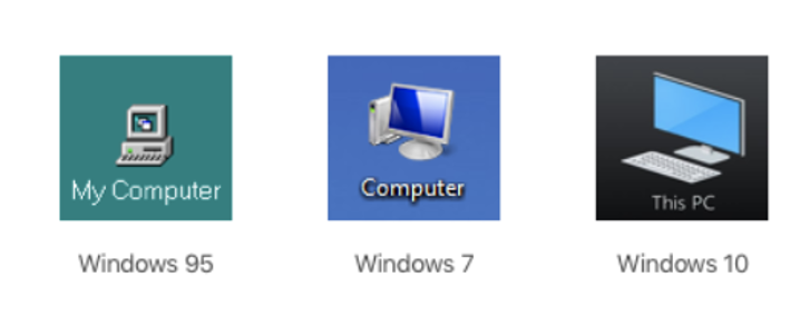

And it’s possible that this is why My Computer used to function properly. Using a computer back then was nearly usually a solo experience. People rarely shared files, and all they had was contained within that single symbol (Saito 2020).
It indicates that the product is conversing with you when it uses the word “your” in the interface. To an extent, the product acts as your personal assistant, guiding you through the process of getting a task completed. “Enjoy your tunes, then” or “Your orders are as follows.”
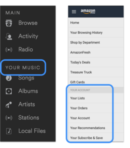

After all, if you’re trying to make your product sound conversational, using “your” might be the better choice. Many tools help consumers do things more quickly, intelligently, and easily, whether they’re paying bills, making appointments, or filling out tax forms.
When to use My and Your?
- My: It’s OK to utilize ‘my’ when the user is interacting with the product, such as by clicking a button or selecting an option from the drop-down menu. However, only include these words if it’s really necessary.
- Your: Use ‘your’ when it’s appropriate. When your product asks a user a question, gives directions, or describes something to the user, use ‘you or your’ instead.
What if neither are used?
It would be more difficult for users to locate goods that belong to them if you didn’t utilize the pronouns “your” or “mine.” Customers want to know where their data is as soon as possible after logging into a site. For them, the word “my” acts as a visual cue. Without the word “your,” visitors will have a tougher time telling which products on a site are specifically tailored to them. They won’t be able to tell if the content is being shown to the public or only to them. Users will be more likely to look at something if it’s displayed exclusively for them. As they wouldn’t know, they may overlook relevant content.

